
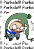
Card Game Feedback Wanted
Hey folks,
We'd love some feedback on the graphic design of the card game we are working on. What do you think of these?
Comments:


9 years ago #9694353
2
0
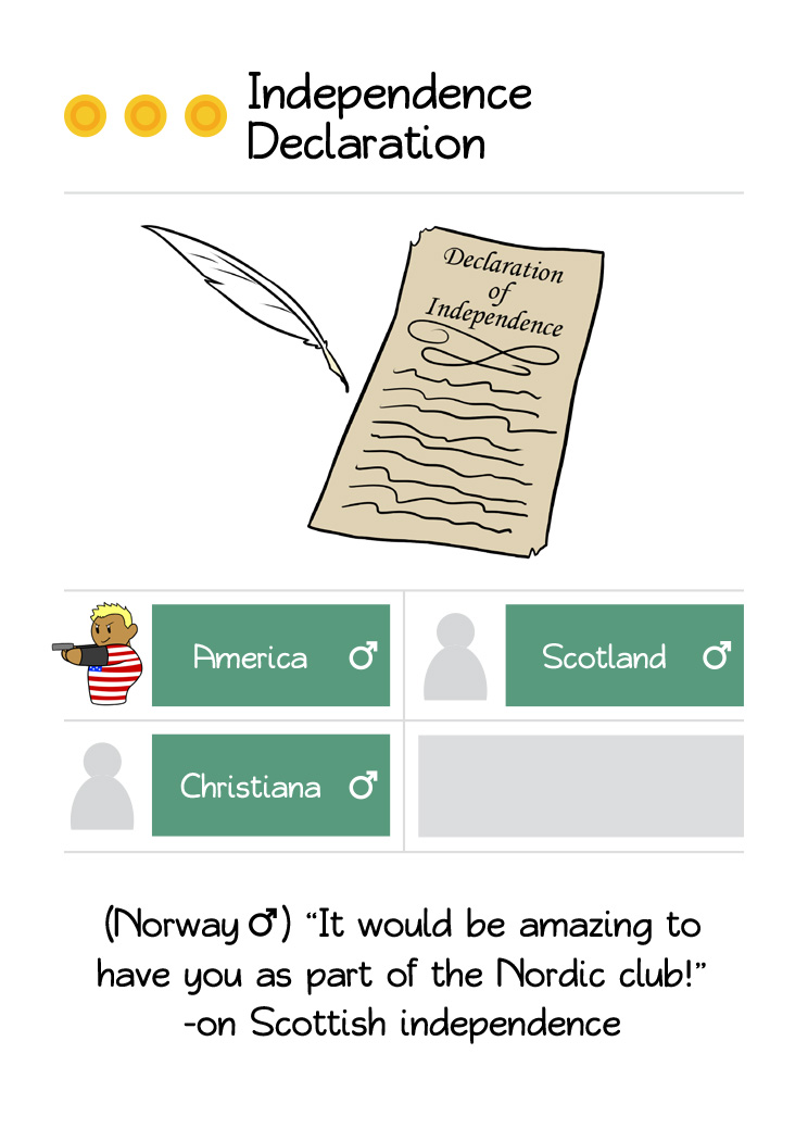
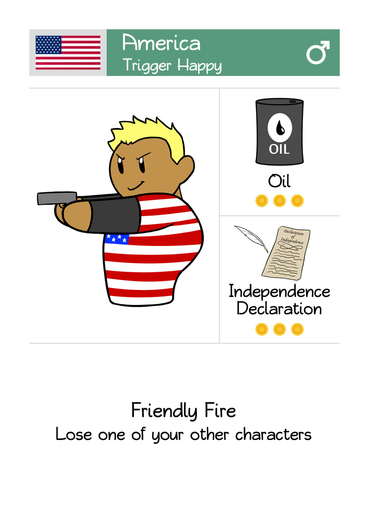
I feel like I should point out it's The Deceleration of Independence. But I love the graphics!
10 years ago #9578627
2
0
HAPPY NEW YEAR EVERYONE AT SATWORLD COMPANY I THINK YOUR AWWWWWWWWWWWWWWWWWSSSSSSSSSSSSSSSSSSSSSSOOOOOOOOOOOOOOOOOOOOOOOOOOOMMMMMMMMMMMMMMMMMMMMMMMMMEEEEEEEEEEE


10 years ago #9557434
2
0
Thanks for all of your feedback, I just passed it back to the graphic designer and we're taking another pass at the graphic design (Also based on things people said on my design blog and the boardgamegeek design page - getting feedback from lots of places because I want this to go really well!)
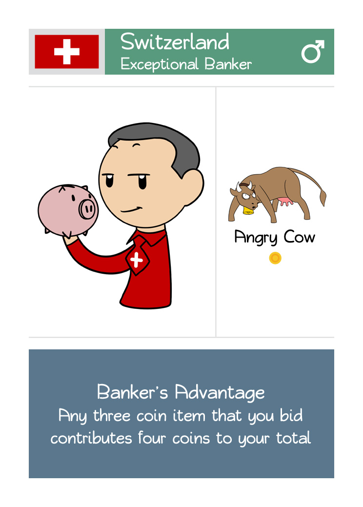
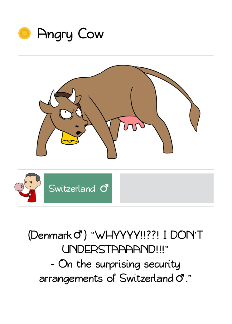
I don't think we're going to get the opportunity to do much with the art style, but the flags and coins are definitely places we can make improvements. The gender tie in to the name bar is important, in playtesting people kept trying to give things to the wrong person (e.g. oil for sister america) because the gender symbol alone wasn't enough to make it obvious if the card's on the table rather than in someone's hand.
For those of you interested in rules, I've not formalised them yet. We've got a draft of an infographic to make it easy to learn the details, which we'd then support with a rulebook that gives more precise definitions to cover all of the tricky situations and edge cases.
https://ksr-ugc.imgix.net/assets/014/063/899/23101cdc186886ad9832f70ce04ff8be_original.jpg?w=680&fit=max&v=1476181959&auto=format&q=92&s=461e021b5dd95b1871de4a02c37d104b
Please bear in mind this is only a draft. I'm pretty embarrassed about the quality of the English in some of it and when we originally threw it together we only had art for Switzerland so everyone is Switzerland - but it should give an overview of how the game plays.


10 years ago #9583715
1
0
Dear Master of SATW,
It's always a pleasure to discover your weekly production.
There's a little thing I find annoying. Whenever I vote, whether it's up or down, just after having voted, the view returns to the top of the screen. It would be user-friendly if the view remained at the post one is reading, especially when there are loads of posts and replies.
You may want to have some additional information. I google to your site via Firefox 50.1.0 on a Mac.


10 years ago #9556211
1
0
I'm actually more fond of Humon's art style than the art style with which the characters are drawn on these cards. Also agree with ryttyr's point about the flags which could be portrayed more playfully. I do like the layout, it's clear and clean. I also like how you use the same font as in the comics. And unlike ryttyr I do think the coins look like coins.
Edit: Almost forgot: of course America should have Trump hair like in the most recent comic
Edit: Almost forgot: of course America should have Trump hair like in the most recent comic

10 years ago #9555918
1
0
Looks really good but wouldn't it look cool if the color of the nameplate was related to the country's flag?
Oh, wait. I just realized it's already tied to their gender. That's probably more important to differentiate visually. Especially since the flags already are portrayed on their shirts/clothes.
One thing though. I think that the coin symbols should look more... coin-y.
like they could have some decorations and a value printed on them (preferably 1 as they represent one coin).
Also, I think it would look more uniform if the flags in the header were drawn using the same art-style as the characters instead of being pictures of the actual flags. Then it would feel more like SatW.

10 years ago #9555621
1
0
Nice looking cards, and I agree with the others. Info on the mechanics of the game will make it easier to judge!


10 years ago #9555449
1
1
#9555389
I'm too lazy to think of a comment on my own, so I'll just agree with the previous one. #9555389
I'm too lazy to think of a comment on my own, so I'll just agree with the previous one. #9555389
Add comment: Please Sign in or create an accout to comment.
20